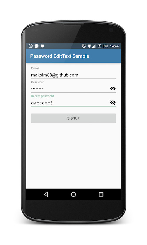
How does the library look like?
Usage
In short: all you need to do it to replace your EditText with PasswordEditText from this library!
<com.maksim88.passwordedittext.PasswordEditText
            android:id="@+id/input_password"
            android:layout_width="match_parent"
            android:layout_height="wrap_content"
            android:inputType="textPassword"
            android:hint="Password" />
You can also wrap PasswordEditText inside a TextInputLayout to get a material design moving label on top:
<android.support.design.widget.TextInputLayout
        android:id="@+id/input_layout_password"
        android:layout_width="match_parent"
        android:layout_height="wrap_content">

        <com.maksim88.passwordedittext.PasswordEditText
            android:id="@+id/input_password"
            android:layout_width="match_parent"
            android:layout_height="wrap_content"
            android:inputType="textPassword"
            android:hint="Password" />
    </android.support.design.widget.TextInputLayout>
Note: be sure to include the design library to use TextInputLayout. (for more details see sample)
You can also use TextInputLayout to achieve an even prettier setError() dialog using setErrorEnabled(true) on the outer TextInputLayout and then calling setError() on it. This underlines the text and shows an error message underneath the text.
Customize
You can add your own custom icons which are shown on the right side of the EditText.
Do this by first adding the custom namespace to your root layout, e.g.:
<LinearLayout
    [...]
    xmlns:app="http://schemas.android.com/apk/res-auto"
    [...]>
</Linearlayout>
After that you can add the icons with the attributes app:pet_iconShow and app:pet_iconHide:
<com.maksim88.passwordedittext.PasswordEditText
    [...]
    app:pet_iconShow="@drawable/..."
    app:pet_iconHide="@drawable/..."
    [...]
/>
You can also set toggle the monospace Font inside the PasswordEditTexts with app:pet_nonMonospaceFont:
<com.maksim88.passwordedittext.PasswordEditText
    [...]
    app:pet_nonMonospaceFont="true"
    [...]
/>
Another customization is to just toggle the visibility of the password when the icon is hovered with app:pet_hoverShowsPw:
<com.maksim88.passwordedittext.PasswordEditText
    [...]
    app:pet_hoverShowsPw="true"
    [...]
/>
If you do not like the alpha, that is set to all the icons, you can disable it using app:pet_disableIconAlpha
<com.maksim88.passwordedittext.PasswordEditText
    [...]
    app:pet_disableIconAlpha="true"
    [...]
/>
For a working example of the different customizations check out the activity_main.xml inside the sample project.
Download
The library is available from jcenter(), so all you need to do is import the dependecy inside your app's build.gradle:
  dependencies {
          compile 'com.maksim88:PasswordEditText:v0.8'
  }
Older versions are still available from jitpack.io. For more info see: https://jitpack.io/#maksim88/PasswordEditText.
Licence
Licensed under the MIT license.